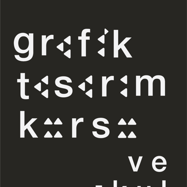
From Ancient Traces to Modern Characters: Cuneiform Typography Design
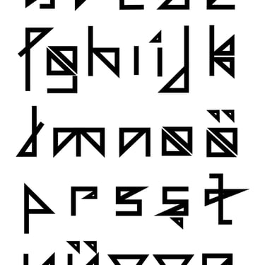
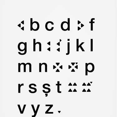
This project is a typeface design journey that bridges the physical origins of writing with modern typography, starting from a curiosity about the tactile nature of cuneiform. The design phase began by deeply researching the forms of cuneiform that came to life on clay tablets, the production techniques of the era (use of styli, texture of clay), and the historical evolution of symbols.
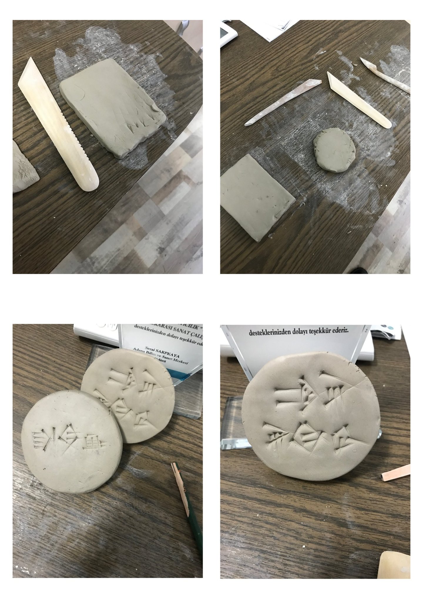
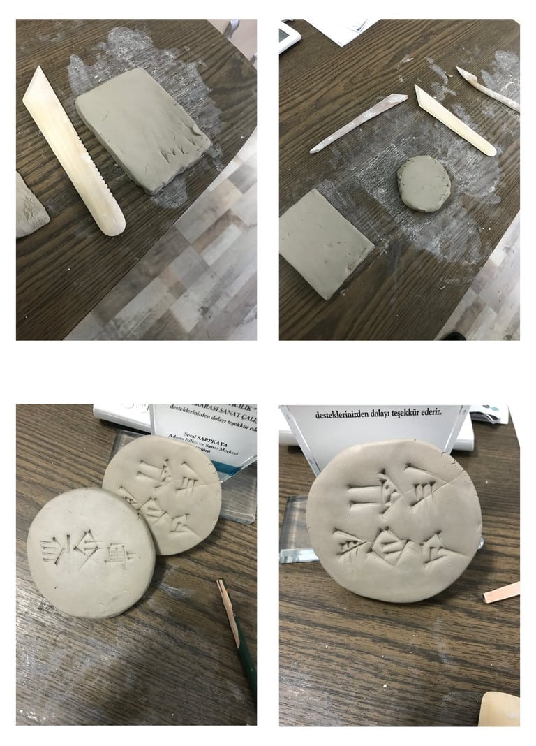
Experimental Process: The initial steps were shaped by direct contact with the material (clay) rather than digital tools. Manual experiments on clay tablets allowed for a profound understanding of the physical dynamics of cuneiform’s characteristic triangular and vertical strokes.
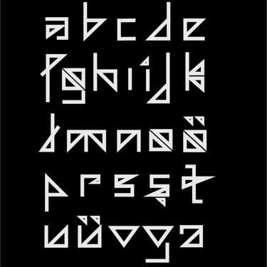
Form and Structure: The typographic arrangement was constructed by adapting the sharp and angular nature of ancient characters to modern alphabetic readability standards. Each letter was built as a geometric stylization carrying the stroke characteristics of cuneiform.
Conceptual Approach: This work is not merely a font design; it is an "archaeological typography" experiment that reinterprets the oldest information recording system through today’s design language. Revitalizing ancient forms in a modern typeface (logotype and text font variations) emphasizes the continuity of history and the evolution of writing.


The Ontology of Design in the Post-Digital Era: Illusion, Copy, and Mass Production
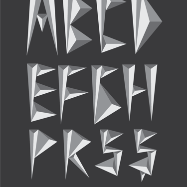
This series of works offers a sharp critique of the artistic and design practices of the digital age. Built upon three central metaphors, the narrative focuses on the manipulation of truth, the replacement of creativity with mechanical repetition, and the qualitative degradation of design.
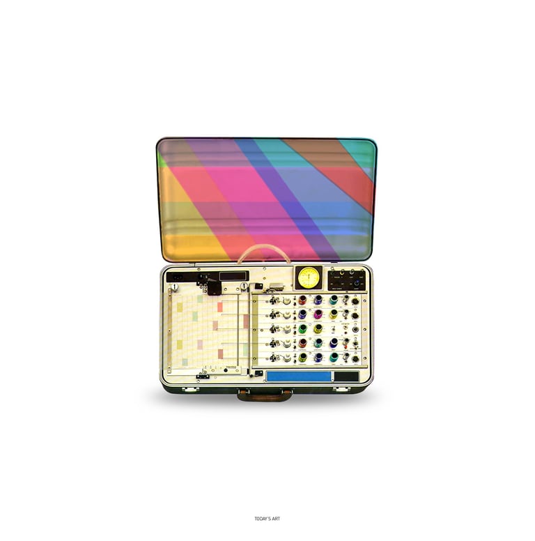
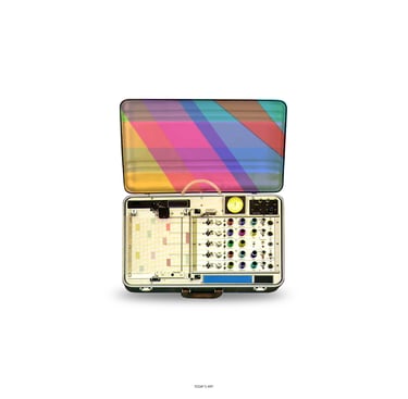
Aestheticized Truth: The Polygraph
Centered on the premise that "art has transformed into a decorated craft of deception," the first piece re-imagines a lie detector as a vibrant, attractive, and "aesthetic" object. The vivid color palette represents the digital noise that masks the truth. By turning a machine designed to detect falsehood into a piece of art itself, the work critiques how art has drifted away from its role as a societal mirror, becoming instead a misleading—yet pleasing—illusion.
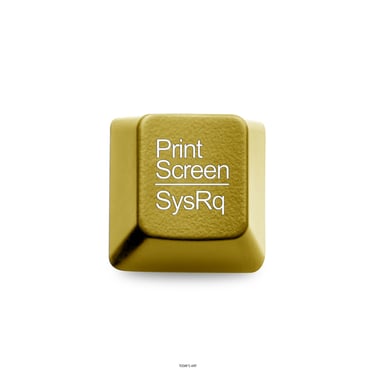
The Golden Command: Print Screen
Presenting an ordinary "Print Screen" key as a solid gold ingot points to the "crisis of creativity" in the contemporary design world. In this context, the act of capturing and copying existing content has become the designer’s most "valuable" skill, superseding original thought. This golden key is an ironic icon; it does not celebrate achievement, but rather the sanctification of "copy-paste" culture and the commodification of appropriation.
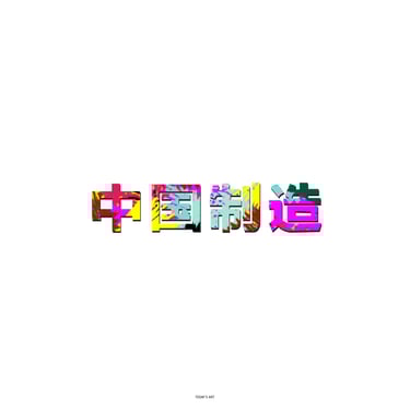
Qualitative Erosion: Made in China (中国制造)
The final piece, featuring the "Made in China" inscription, represents the transition of design into a fabricative process governed by a mass-production logic. The fragmented, glitch-heavy typographic form visualizes the reduction of design from an intellectual depth to a fast-consumption object. It marks the moment where art ceases to be a "craft of ideas" and becomes a low-quality market commodity.